
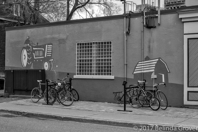
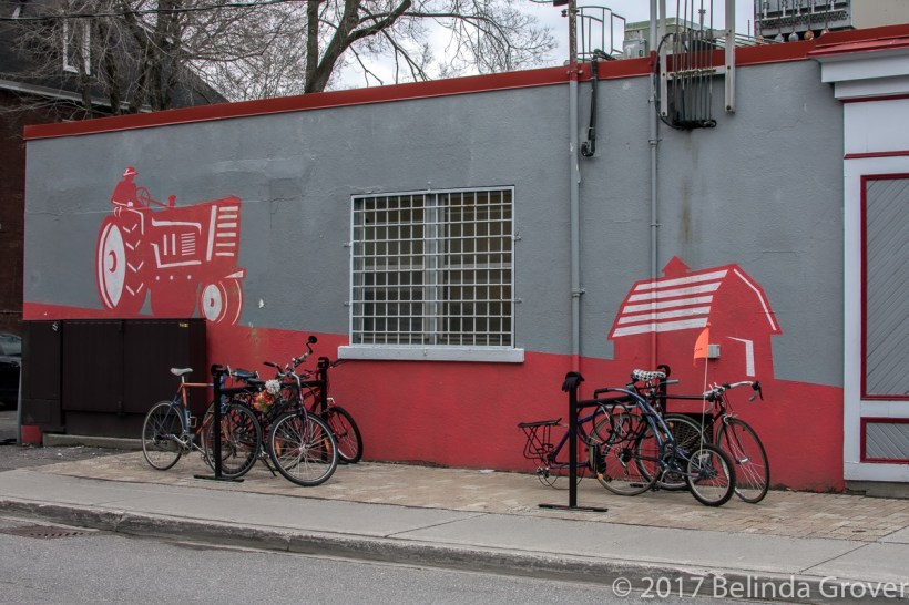
This photo is the exterior of a popular butcher shop in my neighbourhood. The colour version is vibrant, however I think the detail of the structure is more distinct and engaging in black and white. It’s an interesting experience to work a photo in both colour and black and white. MacPhun Tonality CK was used to create the monochrome version you see here.

September 29, 2017 at 2:48 pm
I was very fascinated by both pictures, kinda love the B&W better.
LikeLike
September 29, 2017 at 5:33 pm
Thanks very much!
LikeLike
September 29, 2017 at 1:02 am
yep..the B&W works.
LikeLike
September 29, 2017 at 5:22 pm
Thanks.
LikeLike
September 28, 2017 at 8:37 pm
It’s interesting what the eye is drawn to … in the B&W, I see the window and in the color, the red dominates.
LikeLike
September 28, 2017 at 9:27 pm
Thank you. An interesting way to think about the photograph.
LikeLike
September 28, 2017 at 2:10 pm
I have to agree, too. The B&W actually does more not only for the murals but also for the bicycles, bringing them altogether equally keeping the eye interested. Lovely! 🙂
LikeLike
September 28, 2017 at 2:36 pm
Thanks very much Pete. It seems that the black and white wins out.
LikeLiked by 1 person
September 28, 2017 at 2:38 pm
🙂
LikeLiked by 1 person
September 28, 2017 at 9:14 am
In B&W the first thing that catches my eye is the tractor. In the colour image it is the orange flag on the bike. There is a lot of genetics involved in colour vision and it’s interesting to compare the two images with that in mind.
LikeLike
September 28, 2017 at 11:34 am
Thank you. Interesting comment.
LikeLiked by 1 person
September 28, 2017 at 8:11 am
I prefer the B&W, not only for the building lines and the mural, but also the bikes. Nice!
LikeLike
September 28, 2017 at 11:33 am
Thanks Ellen! Me too.
LikeLike
September 28, 2017 at 7:28 am
I think you are right!
LikeLike
September 28, 2017 at 7:35 am
Thanks!
LikeLike